HUNTER GATHERER TOUR
A project of a visual identity for the tour of Swedish band Avatar that is supposed to promote their new music album called "Hunter Gatherer". The tour was created and invented by the author in order to present an idea for a visual identity that could be used in the future.
LOGO
The main idea was to combine broadly understood modernity with primitiveness. The base of the sign is a hexagon which, on the one hand, is referring to "modern design" and, on the other hand, to
a simplified form of a stone. An abstract sign was created by combining two characters from the oldest variants of the Nordic script corresponding to the letters taken from the first letters of the name Hunter Gatherer, "H" and "G". The logo was prepared and imprinted in linocut technique to resemble the appearance of the first inscriptions made with Nordic runes. Then, it was scanned and preapred as a vector graphic.
FONTS
The main typeface, was chosen based on its history. The sans-serif Tahoma font was designed with computer reading in mind in 1994 by Microsoft. Its genesis refers to the development of technology and thus modernity, which is discussed by the band in the new music album. The Magnesium MVB typeface has been selected primarily in terms of readability, both when used with full fill and only with an outline.
COLOR PALETTE AND LOGO VARIATIONS
The color palette was inspired by the already existing music videos for selected songs from
the Hunter Gatherer album. The author of the project decided on green and pink, which appeared
in the music videos.
TICKETS
Tickets have been divided into categories: REGULAR, VIP and MEET & GREET based on three main groups of recipients characteristic for festivals and concerts.
ID CARDS
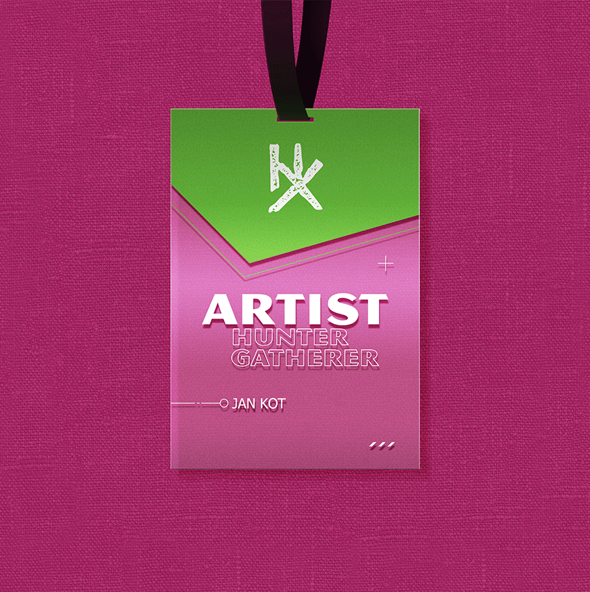
ID cards, as in the case of tickets, have been divided into categories (ARTIST, PRESS, STAFF), which have been assigned to different color variants for simple and quick identification.
WRISTBANDS
Concert wristbands have been divided and appropriately marked according to the type of ticket they correspond to.
ILLUSTRATED POSTER
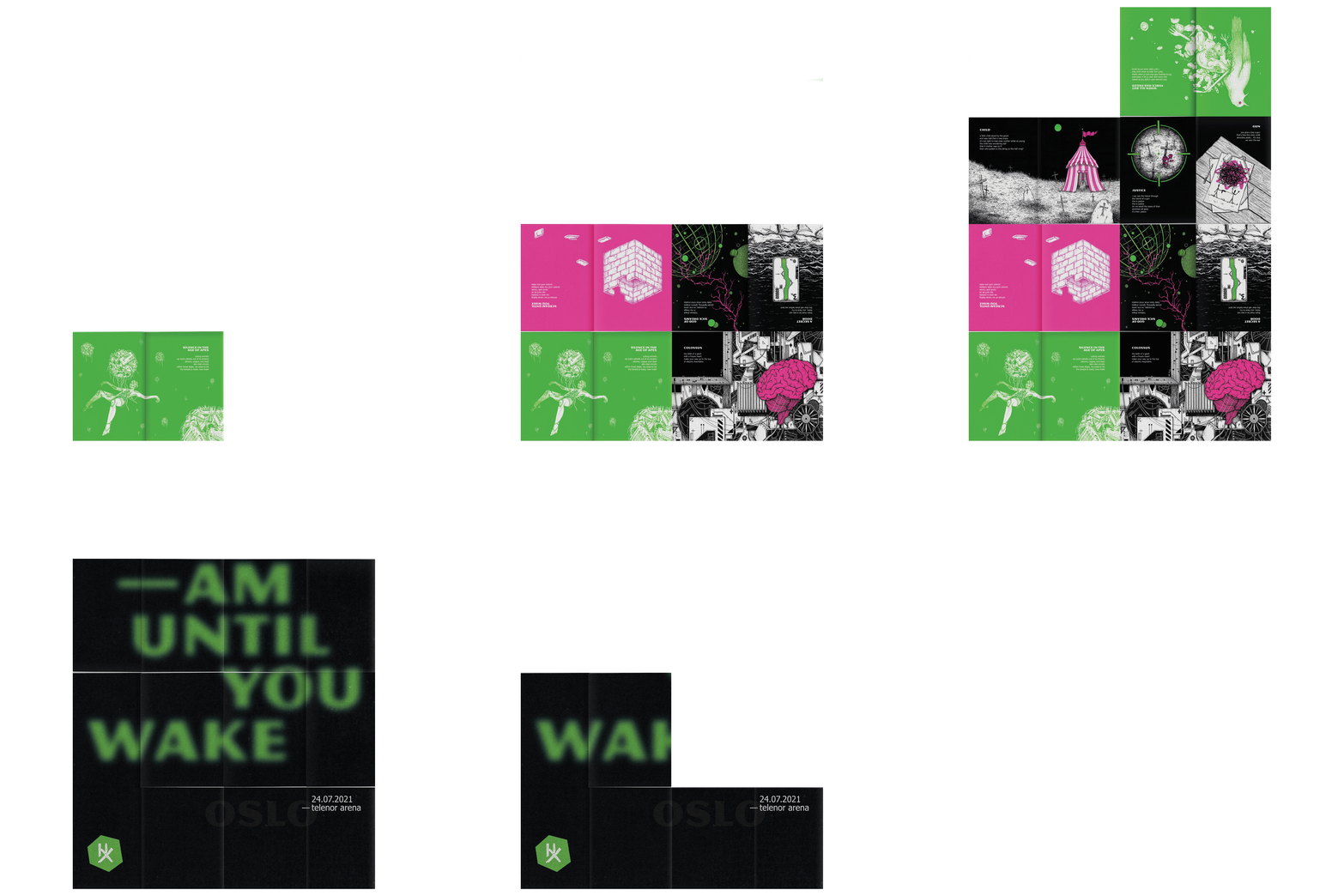
The collector's poster was prepared based on the illustrations and typographic posters. Its folded form allowed to place drawings relating to individual songs on one side of the sheet, and the selected typographic poster on the other. When the 50 x 70 cm sheet of paper is properly folded, a small book of 12.5 x 17.5 cm is created, which allows you to easily view the graphics. After unfolding it, we get a full-size poster, which is on the back and depends on the city in which the event takes place. The recipient can decide whether to keep the printout in the form of a book or poster that can be considered as collector's item.
POSTERS
Four informative posters were created, including one printend on transparent foil, which cosists of a stylized and personalized QR code, which transfers the recipient to the website containing all information about the tour and chosen event after scanning. The remaining posters, on the other hand, contain a NFC tag that replaces the traditional URL address or a QR code.
TYPOGRAPHIC POSTERS
Typographic posters have been designed with the individual songs of the band's new album in mind. Each song corresponds to one city in which the event is to be held, so the final tour would consist of ten performances. The titles were presented in various forms and typographic layouts to reflect the mood of the song.
FLYERS
Leaflets were printed on transparent foil. Three variants of leaflets for each of the ten cities were created, each of them in two color versions. They contain a NFC tag that allows you to find more informations about individual concerts on the website.
STAGE
The model was designed and made in the Blender 3D program. It was created for easy assembly and disassembly in a relatively short time between performances. The main part of the stage consists of three huge screens, one behind the drummer, two at an angle on the sides of the platform. They are supposed to create a continuous link between artists, music and all kinds of visual activities.
ANIMATION
Before the band's performance starts, the so-called fog screen appears. It is a "screen" made of fog that allows to play various types of visualizations and images on it. A typographic animation is displayed that shows the individual words of the narrative spoken by the singer.
COLLECTOR’S LP
The packaging of the collector's cover has been designed for a LP record. The assumption is to resemble CD packaging, and thus to computers and broadly understood modernity. The vinyl is intended to be recorded live during individual events and available for later purchase on the website.
T-SHIRTS
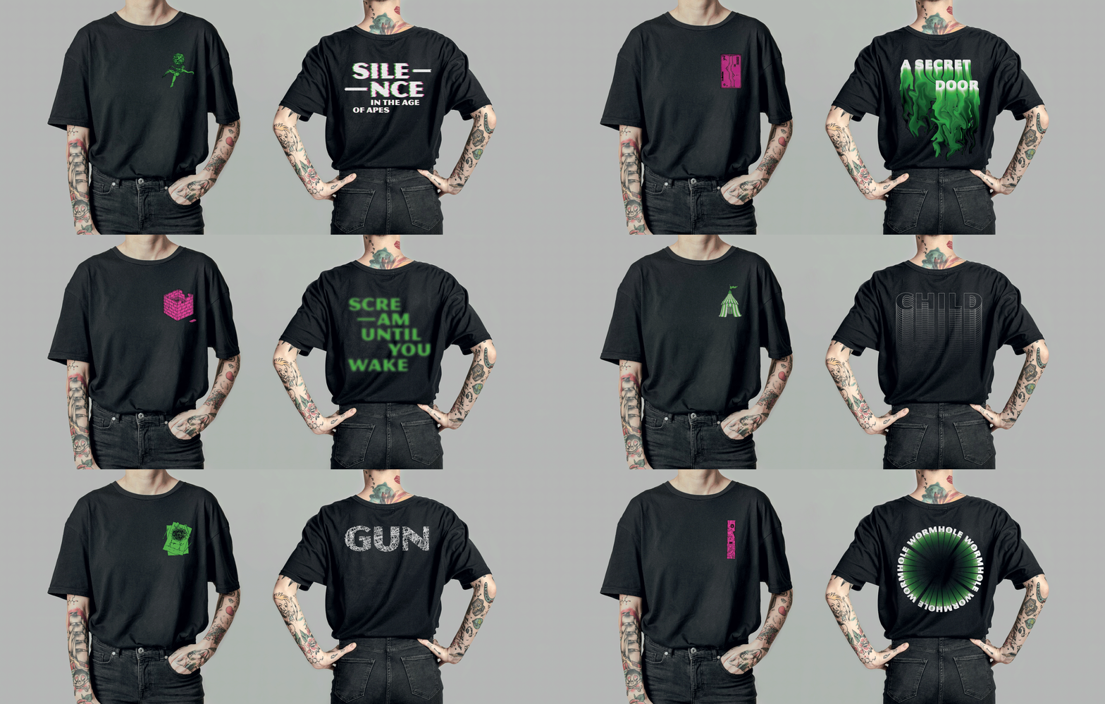
The illustrations and typographic posters were used in the designs of concert t-shirts. A small fragment of a drawing has been placed on the front, while typographic design taken from posters on the back.
ACCESSORIES
Transparent sheets, 18 x 25.5 cm each, made of plexiglass were designed as a collector's item, which are referring to the appearance of music players apps. Currently it is a fashionable gadget among collectors who hang it on the walls. There are ten different versions, each corresponding to a song. After scanning the NFC tag hidden behind the picture, the recipient is sent to the song on band's official channel on YouTube.
Non-commercial project


